Which of Final Fantasy’s prolific logos is the best? Here’s our ranking of all the Final Fantasy logos.
Ranking the Final Fantasy Logos: Ground Rules
Before jumping into the ranking, note that this list will only include mainline Final Fantasy games. As cool as Final Fantasy 12: Revenant Wings’s logo is, this list would never end if we opened it up to spin-offs and sequels (no disrespect to Final Fantasy Fables: Chocobo’s Dungeon).
Additionally, this ranking will only look at the “Yoshitaka Amano logos,” the ones illustrated by artist Yoshitaka Amano. It might seem like an odd distinction to make, since the plain “FINAL FANTASY” text accompanied by a distinctive Amano illustration are what people associate with the series. However, these logos only started with the original release of Final Fantasy 4. The original logos for Final Fantasy 1, 2, and 3 have their charms, but they’ve since been reworked into “Amano logos” for brand consistency, and these are the ones that will be ranked in this list.
All Final Fantasy Logos, Ranked
#16: Final Fantasy 9
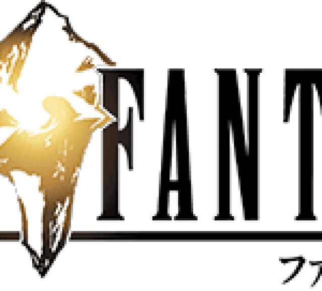

As I sat down to research and prepare this list, I realized I could visualize every Final Fantasy logo in my mind… except for 9’s. It’s a crystal. That’s it. Yes, the crystal is important in Final Fantasy 9, but it’s also important in a lot of other games in the series. Although there will be logos that are far messier, they’re at least memorable in their messiness. The problem with Final Fantasy 9’s logo isn’t just that it’s plain—it’s that it’s forgettable.
There are some highlights, however: the gold into black gradient of the crystal and the black into gold gradient of the numeral “IX” are subtle but very classy visual effects and do add some much-needed appeal to the logo.
#15: Final Fantasy 8
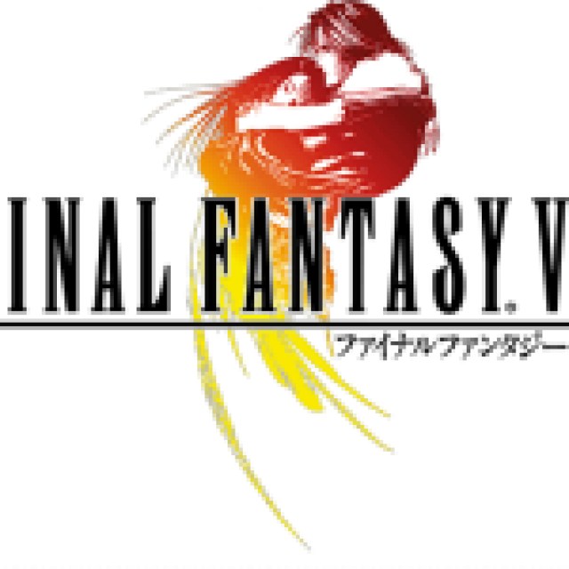

The Final Fantasy 8 logo is well-known, but it isn’t one of the best in the series by a long shot. The colors are stunning; they’re some of, if not the best in a Final Fantasy logo, which helps its memorability. But there’s more to a logo than its color—there’s also its silhouette to consider. Strong silhouettes help an image’s legibility. They are especially important for logos, which must be clear even from a distance. Final Fantasy 8’s logo’s silhouette is very unclear. It’s not imperative to know exactly what’s going on from a silhouette alone, but Final Fantasy 8’s gives rise to the main issue of the illustration: it’s just not one of Amano’s best.


Why is Rinoa melting into strands? She is obviously being abstracted in an attempt to simplify the image shape without simply cutting it off at the title’s underline, but the image of Squall and Rinoa hugging is almost too complex to be abstracted like this. The result is a strange silhouette for an alright image. Admittedly, there is something clever about the silhouette looking like a hurricane when the protagonist’s name is Squall, but it still isn’t great. For all this logo gets right, the more “illustrative” Final Fantasy logos are just better.
#14: Final Fantasy 5


Final Fantasy 5 is a painfully underrated game, but as much as I want to use every possible opportunity to sing its praises, I simply can’t do that here. The Final Fantasy 5 logo is another “nothing” logo. As important as wind drakes are, they’re hardly the first thing people think about when they think of Final Fantasy 5. The logo doesn’t convey notable information nor is it very interesting. At least the way the wind drake’s tail wraps around one of the letter As is very cute.
#13: Final Fantasy 12
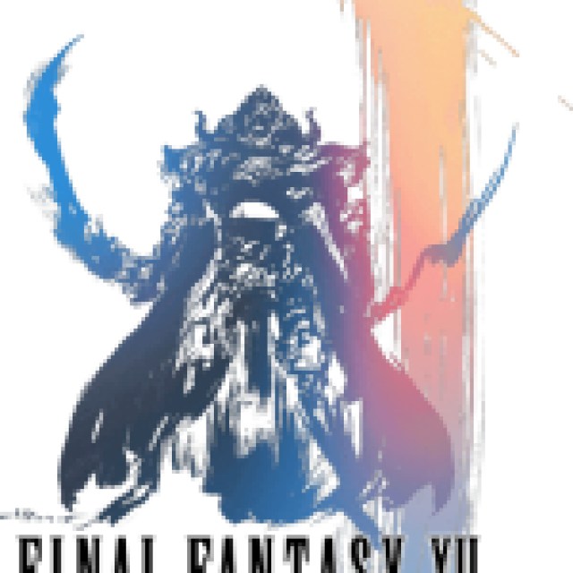

The illustration of Gabranth for the Final Fantasy 12 logo is a beautiful work of art. The pose, which occurs in-game, is striking, and the brushstroke on the right is a nice artistic touch. On the flip side, it detracts from the “logo” of it all. It’s easy to forget this is a logo since the game title gets lost in the artistry.
#12: Final Fantasy 14


It’s a shame that A Realm Reborn fixed so much of what was wrong with the original release of Final Fantasy 14 but didn’t fix the game’s logo. The silhouette is unreadable, but has an explosive quality that is very appealing. The problem is what’s inside that silhouette: 14 warriors all getting crammed into the logo equivalent of a sardine can. There’s just too much going on, even if the illustration itself is appropriate for the game’s ideas and story. Characters getting lost makes it hard to appreciate what the logo does do well.
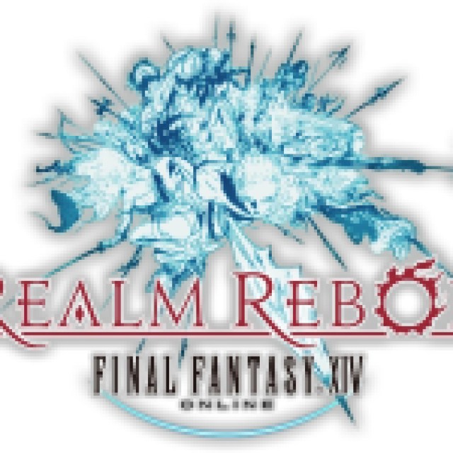

The image placement is definitely an improvement, at least. In the original logo, the sword and spear are nice framing around the title and serve as points of emphasis, but the logo as a whole is way too left-leaning. A Realm Reborn places the illustration above the title (even in the most recent version that removes the “A Realm Reborn” wording) almost like a crown. That gives the logo a sense of balance—and with how chaotic the illustration is, the logo really needs it.
#11: Final Fantasy 11


Final Fantasy 11’s logo is very busy and doesn’t feel very significant, but it pulls off its concept better than Final Fantasy 14’s logo. The silhouette is interesting, and its placement above the game title adds to it by serving as a sort of platform for the illustration to rest on. It’s not the most outstanding Final Fantasy logo, but it does its job well.
#10: Final Fantasy 10


Final Fantasy 10 features another busy logo but with beautiful colors and an interesting silhouette. The logo depicts a sending, giving the illustration a sense of narrative relevance. The nature of sending also makes it much easier to make abstract. As a result, the Final Fantasy 10 logo handles abstraction, with the morphing of Yuna’s dress, much better than, say, the Final Fantasy 8 logo.
#9: Final Fantasy 16
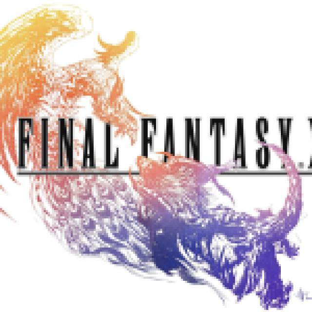

Final Fantasy 16’s logo features Phoenix and Ifrit fighting, which is a good choice for the game overall. It’s a dynamic silhouette, and the image is made all the more fun with the elements that overlap the title. Final Fantasy 16’s logo image has the most illustration overlapping thus far, and it’s used to good effect. It implies depth with a clear foreground and background and turns the title into a true midground element, making it a part of the artistry as much as the illustration.
#8: Final Fantasy 1


The not-so-original logo for Final Fantasy 1 does what it needs to do: it makes the name of the game clear, and it has a legible image of something that conveys an important idea about the game—in this case, the Warrior of Light. The back-turned pose is appealing and gives the logo a sense of tension: while you read the game name from left to right, you see the Warrior of Light’s sword going from right to left. The sword also overlaps some of the word “Final,” which is a nice visual touch. Fun fact: this pose was taken from the Japanese box art of Final Fantasy 1, making for a clever reference.


The two newest versions feature more detailed illustrations of the Warrior of Light. The first of the two cleverly utilizes a similar directional tension, this time with the Warrior of Light’s horns going to the left and his sword going to the right. The third version opts for a highly detailed front-facing illustration that is beautiful but feels almost too ceremonial, like it would be part of press kits and on websites but not on the game’s box art itself. Sometimes simpler is better, although I wouldn’t be opposed to buying posters with the new versions of the logo on it.
#7: Final Fantasy 2


Like Final Fantasy 1, Final Fantasy 2 didn’t start off with an Amano logo. Unlike Final Fantasy 1’s remade logo, Final Fantasy 2’s doesn’t come from its original box art, which features Firion. Instead, Final Fantasy 2’s logos feature the Emperor, whose killer design has the power to carry the logos he graces. The first Amano logo lacks the Emperor’s striped epaulettes, but his horns still give the logo an interesting, if simple, silhouette. The second version keeps the idea of the first but expands upon it, showing a more detailed illustration of the Emperor while utilizing a similar silhouette.
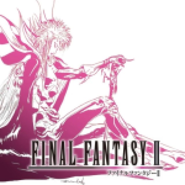

The third version has a similar drawback as the newest Final Fantasy 1 logo: it feels better suited for promotional material than for packaging. The art itself is stunning, however. The downward slope of the silhouette gives the illustration a sense of movement even though the Emperor is sitting down. It also nicely aligns with the left-to-right movement of reading the title beneath him.
#6: Final Fantasy 3
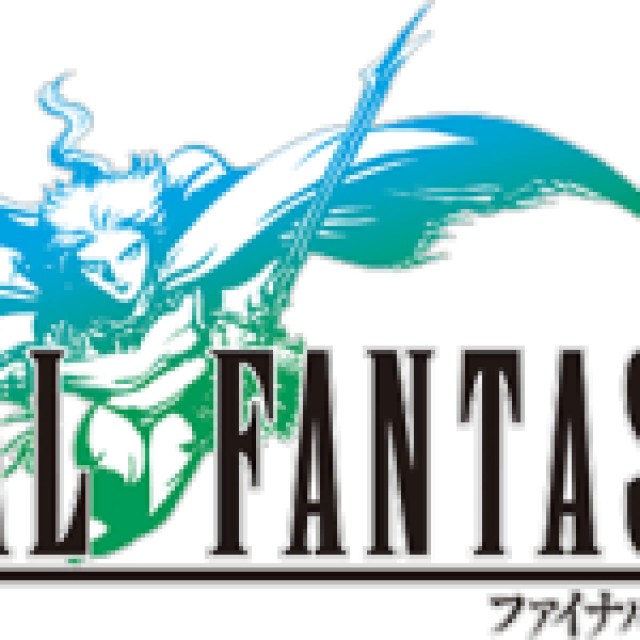

At first glance, the Final Fantasy 3 logo seems “just fine.” Admittedly, it gets away with “just fine” because the Onion Knight really is the most significant element of this generally simple game, much like Final Fantasy 1 and the Warrior of Light. The Onion Knight is no slouch, however: he sports a visually interesting pose, his swords and cape contributing to a dynamic silhouette.
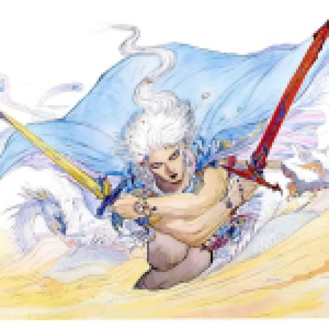

Final Fantasy 3 was the last game to have a “non-Amano” logo, so this logo was made for it for the Nintendo DS remake. The pose of the Onion Knight mimics the illustration on the gorgeous original Japanese Famicom (NES) box art, giving the logo an extra layer of meaning and even a sense of history. The logo’s simple but effective charm and its history elevates it to a level beyond just “just fine.”
#5: Final Fantasy 15


Final Fantasy 15’s logo does a fantastic job of taking a somewhat simple silhouette and putting a lot of detail into it without being overwhelming. Most of the detail comes in the form of the Oracle’s headpiece and folds of her dress, giving the audience more to see upon closer inspection without going overboard. The illustration also does a good job of framing the game’s title, enhanced by the overall rightward momentum of the piece. The illustration also gives the logo interesting bits of negative space, or the empty space in a silhouette, especially between the Oracle’s wing and flowing dress.


What makes Final Fantasy 15’s logo even more interesting is that it changes at the end of the game to reflect the ending scene. Noctis is added to the image, and as beautiful as it is, he doesn’t look like he exists on the same plane as the Oracle he rests beside. He feels like he was slapped onto the illustration later—and that’s because he was. According to an interview with Director Hajime Tabata in the Final Fantasy 15 Ultimania, part of the reason Noctis was added to the game’s logo is because Noctis’s Japanese voice actor Tatsuhisa Suzuki requested it.


Even if Noctis was a spontaneous later addition, the “final” logo of Final Fantasy 15 still has some compelling features. Noctis’s cape removes the interesting negative space of the original logo in exchange for an upward arc that contrasts with the Oracle’s dress, creating an overall downward momentum in the silhouette overall. It’s always interesting when a logo changes in response to something in the game itself. These logos aren’t seen by the general public and derive much more of their impact from what they represent in-game. Noctis may have been an unexpected addition to Final Fantasy 15’s logo, but the end result is still stunning and full of meaning.
#4: Final Fantasy 13
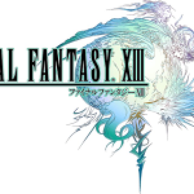

This game may have many problems, but its logo isn’t one of them. Final Fantasy 13’s logo has a similar feel to Final Fantasy 15’s initial logo, with a simple silhouette that leads the way to more details that the audience can discover without feeling overwhelming. Their similar vibes make sense since Final Fantasy 15 was originally going to be released as Final Fantasy Versus 13, all the way back in the age of the dinosaurs (2006).
In addition to the simple circular shape of Cocoon, the characters surrounding it turn the edges of the silhouette into a counterclockwise spiral. The literal spiral jutting out from the bottom also adds a visual focal point that stands out when the logo is viewed from far away or printed very small. All of these details are very important to Final Fantasy 13’s story, giving the illustration extra relevance to anyone who has seen the game through to its end. Final Fantasy 13’s logo is striking, memorable, and meaningful; even if the game itself isn’t one of the series’s best, its logo definitely is.
#3: Final Fantasy 4


When it comes to iconic imagery, it’s hard to top Kain Highwind in the original Final Fantasy 4 logo. It’s so simple: he’s just standing there, but it’s the way he stands that makes this logo amazing. His back is straightened with confidence, but he’s standing on one leg, adding diversity to the silhouette and indicating strength and impressive balance. His spear lies tangential to his thigh as it pierces into the last two letters of the word “FINAL.” Kain’s back and the end of his spear nicely frame the “F” in “FANTASY,” completing this simple but outstanding logo. It’s no wonder this pose has been referenced by subsequent Dragoons throughout the series’s history.
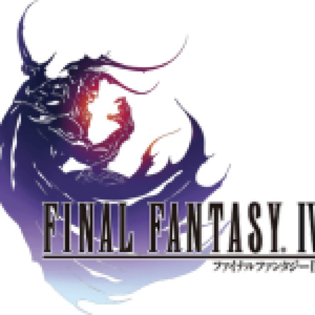

Surprisingly, this iconic logo was entirely redone for the Nintendo DS remake of the game. The new logo features Golbez in a sinister crescent shape, made all the more menacing by his horns, curled hand, and frayed cape. The hint of red peeking onto his face and hand is a great touch, and it matches the color scheme of The After Years’s 3D remake logo. In fact, Golbez’s crescent shape itself can be seen as a reference to The After Years’s logo, which features Final Fantasy 4’s two moons. The Golbez logo may not have an iconic history like the Kain logo, but it definitely has the design prowess to back it up. While Final Fantasy 13 has a stunning, iconic logo of its own, Final Fantasy 4 has two that are drastically different but still outstanding in their own ways, letting it narrowly surpass Final Fantasy 13 and make its way into the top three spot.
#2: Final Fantasy 6


For all my talk about silhouettes, none of the Final Fantasy logos utilize any true silhouettes except for one: Final Fantasy 6. It features Terra riding Magitek armor, imagery that is important to the game, and also features in many different Amano illustrations. The logo image itself is a true silhouette, with no details to find within but still conveys a powerful idea with mere solid shapes. Terra leans forward, brandishing her blade, moving the logo leftward along with the front of the Magitek armor. Meanwhile, her hair, waving wildly in the wind, and the wings of the armor give the logo some tension, pulling it to the right as you read the game’s title. As a silhouette, this logo is legible at any size, and the red into black gradient is also eye-catching. It’s hard to distill such a complex game with an entire ensemble of playable characters down into one image, but the Final Fantasy 6 logo does so with absolute success.
#1: Final Fantasy 7


Final Fantasy 7’s logo has a bit of an unfair advantage. Part of what makes it so iconic is the game it’s attached to: everyone knows Final Fantasy 7 whether they’ve played it or not, and everyone recognizes its logo in the same way. Final Fantasy 7’s popularity aside, this logo works a miracle: it takes the simplest shape, a mere circle, and turns it into something instantly recognizable through color and minor details.


Meteor is a major part of Final Fantasy 7’s story, making it a good choice for the logo’s illustration, but a tricky one all the same. The master artist Amano’s concepts for the logo art show just how difficult it is to make a circle interesting enough to be a logo that conveys the essence of a game at any distance. The prototype logos tell a similar story: the tail of the meteor could have been too wispy, or the meteor itself could have been placed too far to the left, or too centered, and the colors might not have been appealing. Every logo goes through a similar creation process, but Final Fantasy 7’s logo shows just how big a difference even a millimeter can make when crafting a logo.
The logo we did get has just the right amount of movement in the meteor’s tail, the placement isn’t too centered but it also isn’t too left-leaning, and even the colors are perfect. The earthy blue and teal tones are spot-on for Final Fantasy 7’s story focusing on the planet. The white on the left of the illustration allows the game’s title to be easily legible, almost welcoming the title into the meteor itself. The black at the very tip of the tail closes it out, adding a sense of synergy with the black font of the title and “combining” with the white to reference the Black and White Materia. The Final Fantasy 7 logo takes a risk with simplicity, but it pays off in a big way thanks to a combination of all manner of design elements working together in harmony.

